Resurfacing
Oh my, it has been a while, hasn’t it?
In my defence, it’s been a crazy summer, and I have been juggling many different balls. Thankfully, all the work we’ve been doing has finally come to fruition, and is all now out there in the world so we can talk about it. First off, the work I’ve been doing for the last year or so with Sumo Digital, on Nike+ Kinect Training.
This was mostly working on the localisation aspect, as the game is translated into some 15 languages across 3 discs, there was a lot of voice content to get in. I can’t take much for anything else, but I think the folks at Sumo did a great job on it – certainly when I’ve had to actually stand up in front of the Kinect and do some real exercise, I’ve certainly felt the burn!
In-house however, we’ve had another big project that we’ve put our heart and soul into. Last year, Bliss Kiss Productions approached us with a pitch to re-make Daley Thompson’s Decathlon, for mobile devices. Of course, we loved the original game, I think anyone who had a Spectrum or Commodore 64 will have played it at some point: personally I abused my old rubber-keyed Spectrum 48K terribly to try and get a decent score. Thankfully I didn’t have a joystick at that point, otherwise I’m sure it would have been broken just as many others did theirs. So the chance to bring it to mobile was something we couldn’t pass up.
While we did some solid work on it in autumn last year, other commitments meant that it wasn’t until this summer that we could tackle it in earnest. Which, combined with all our other ongoing commitments, made for a lot of work. Dan’s been in pretty much the whole summer working flat out on it, and seems pretty chuffed with his first proper published title.
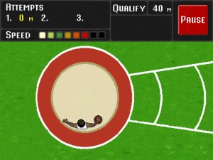
It’s a remake from the ground up, obviously. Looking back at the original version it was clear that the design was still fun (we spent more time playing than taking notes when researching), but the rose-tinted glasses of nostalgia allowed us to forget just how dated the graphics looked. On the Spectrum version, Daley’s an all-white blocky sprite with only a few frames of animation! There were also a lot of design decisions that were clearly made due to technical limitations (such as the shot put taking place on a straight track, instead of in a circular pit as it does in real life). Some of those decisions we revisited, but where there was a design case for it, we erred on the side of the original.
What was pretty clear, Â from even the first round of focus testing, was that the original was brutally hard in its learning curve. Running events like the 100m and hurdles are straightforward enough, but three events in particular were unique in their own way: the high jump, pole vault and discus throw all differ in style. Instead of rewarding frantic tapping, they are games of timing. In the 80s, it was fine to spring that sort of challenge on the player and expect them to learn it on their own, but modern players are nowhere near as understanding. With that in mind, we put in a practice mode that allowed players to learn how to master particular events, without the added pressure of participating in the whole decathlon; and we put on-screen prompts and buttons to guide unfamiliar players through each event.
Also needing wholly revisited were the controls themselves. As a first principle we wanted to replicate the frantic button mashing / joystick waggling of the original; the user should have to break a sweat to get those high scores, especially in the 400m. At first glance the touch-screen controls seem obvious, alternating between left and right sides of the screen to run. But finding a way to let the user throw and jump without a) accidentally jumping when they didn’t mean to, or b) having the on-screen feedback be underneath the user’s fingers, was not a trivial task. Worse, when you introduce multi-touch, we had to find a way to handle input so that it was always physically hard to achieve the maximum speed. Later focus testing revealed that our use of an on-screen button for throwing / jumping wasn’t working; users were interpreting “HOLD” as a prompt, not a button, and simply holding their finger down wherever they last tapped. Based on that, we revised the controls to respond to exactly that action.
On the visuals and audio, we wanted to aim somewhere between modern and nostalgic. For the art side, we brought in Paul Helman to work on the graphics, and we feel he was right on the mark in his style – not blocky or restricted in colours, but also not trying to be too realistic. At first we were worried about how Daley Thompson would react to the stylised look we gave him, but all the feedback was positive.
For audio, we worked with Gavin Harrison, who did a great job experimenting on the audio we needed. Evoking the ‘old style’ in audio is somewhat harder; the audio chips of the 8-bit era had a very limited range, which just sounds silly nowadays. In the end, we went for a simple synth-sounding musical theme, and some very slightly distorted audio samples.
We finished our work at the end of September, and the game itself was released on iOS and Android on the 21st of September. The PR machine for the launch is in full swing, and we’re eagerly awaiting the public’s reception of it. When the dust has settled, I’ll try to write up a post-mortem of everything we’ve done, what worked and what didn’t, but right now I’ve been enjoying some well deserved time off!


You must be logged in to post a comment.